Explore the before-and-after images below to envision how I might optimize your work for:
Accuracy and clarity of key ideas and learning outcomes across images, text, and other content
Audience fit, e.g. language, tone, design approach, and color palette
Aesthetic principles in graphic design and data visualization
Accessibility, equity, and inclusion, e.g. disability-friendly colors and inclusive language
Requirements for publication and intended digital and/or print platforms
Note that, for intellectual property and/or platform reasons, images may not be sharp on your screen. If you’d like to see a higher-resolution image, please contact me to request a read-only link.
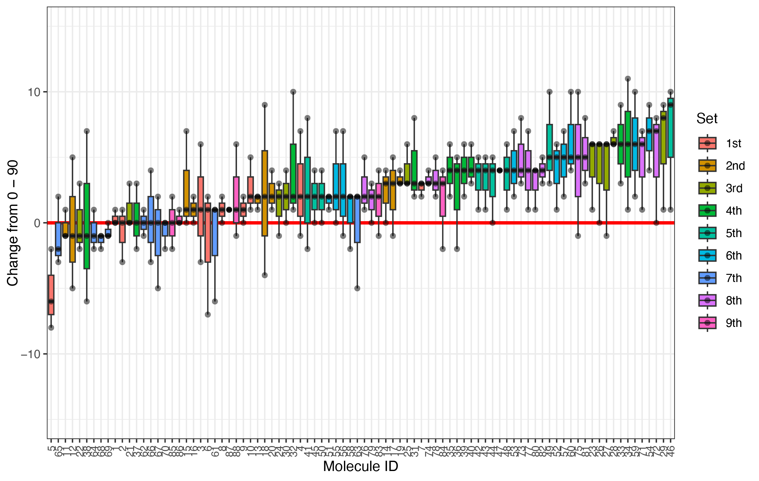
BEFORE: This information-packed array is meant to help the reader 1) easily understand how different infection treatments affected tree health and 2) readily distinguish earlier vs. later planting rounds to see the potential influence of other factors like weather and operational refinement. However, with a rainbow color scheme the first and last rounds are most similar - and the panel is both more cluttered and less informative than it could be. AFTER -->
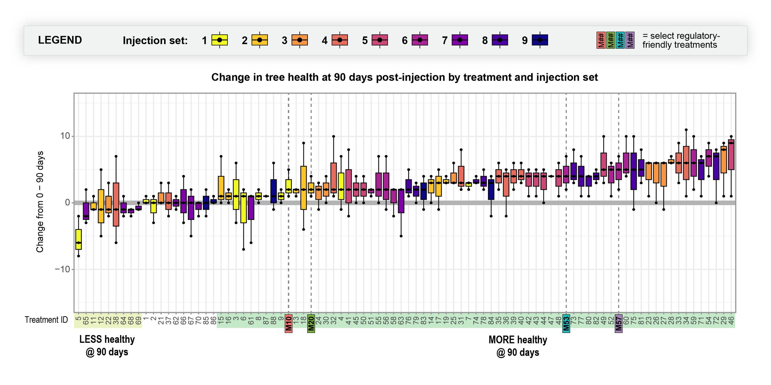
(<-- before) AFTER: With a linear color scheme and informative design choices, the redesigned array clearly showcases which treatments led to better (or worse) crop outcomes, whether the best treatments were among the earlier or later planting rounds, and how 4 industry-ready treatments performed.
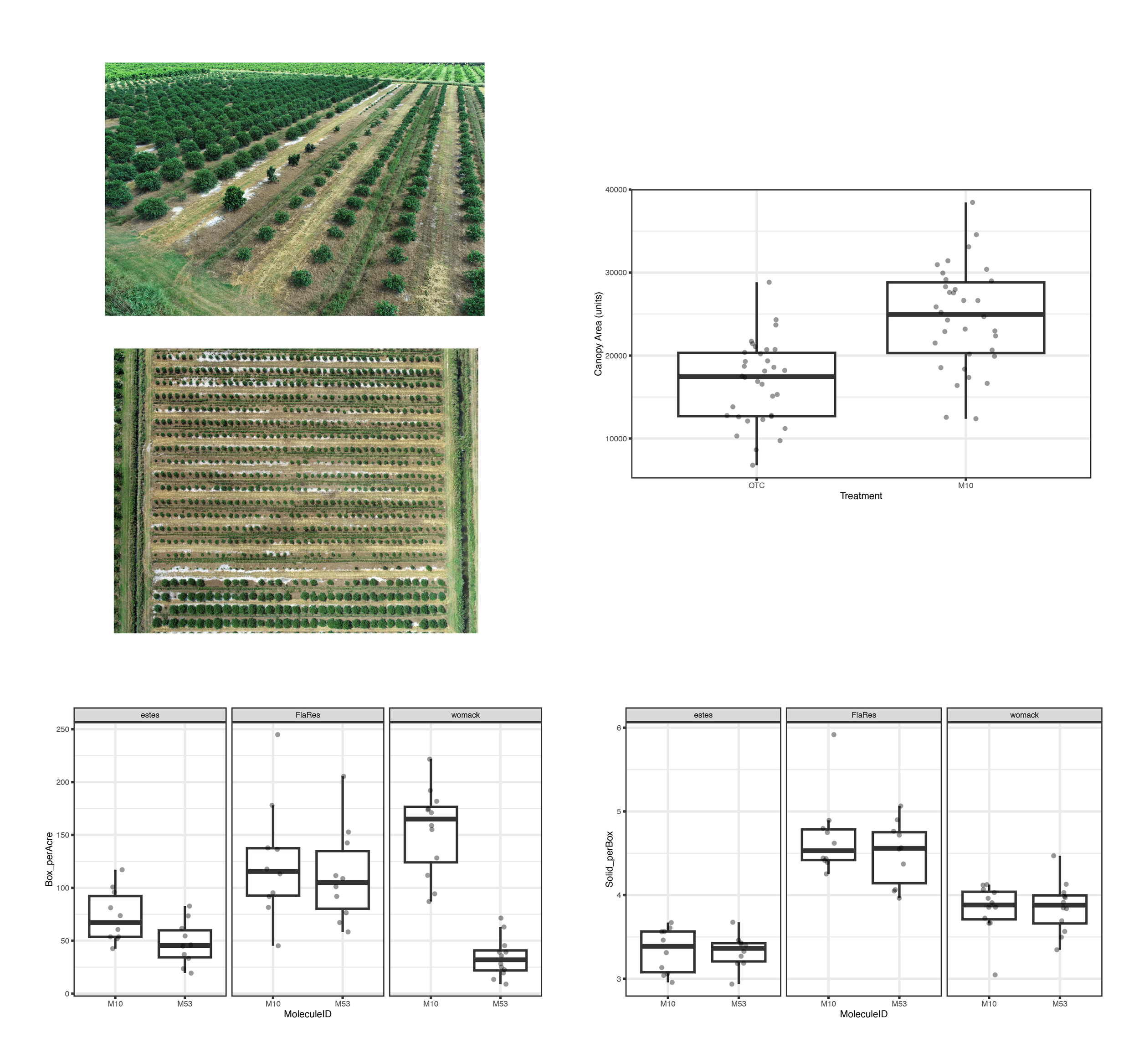
BEFORE: Two photos and three box-and-whisker plots are meant to 1) show where two different crop treatments were applied in the field and 2) compare the crop outcomes between those two treatments. However, a lack of cohesion and clear labeling makes it hard for the reader to make key connections. AFTER -->
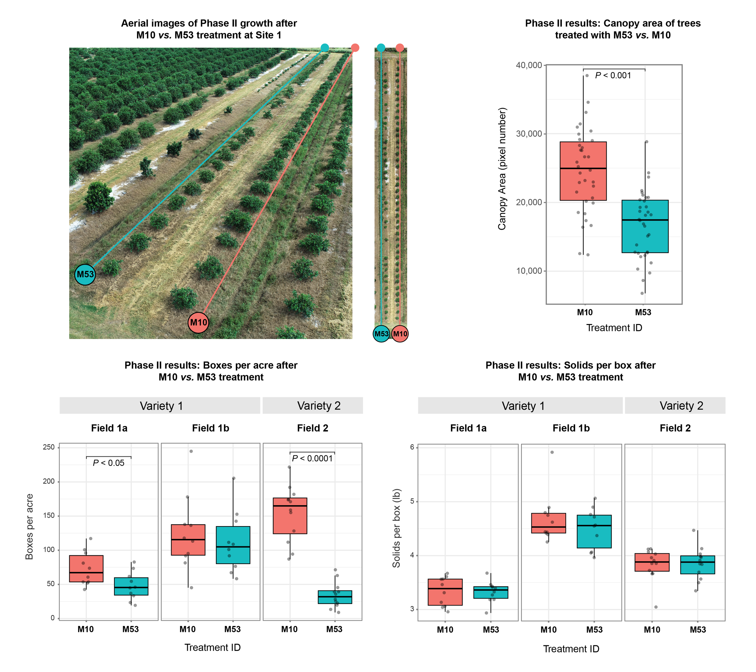
(<-- before) AFTER: The redesign incorporates color to help the reader see growth differences between treatment rows and make key connections between the image and statistical panels.
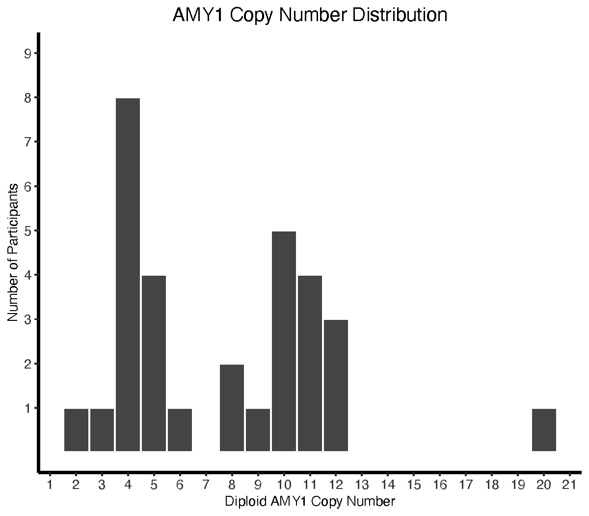
BEFORE: The simplest plots can be the most confusing! Here, similar axes and abstract bars demand more cognitive work to grip how many people had each number of gene copies. AFTER -->
AFTER: Iconography takes it from abstract to real, immediately grounding the viewer in what they're looking at. Axis reformatting focuses the reader on groups of interest. With this redesign, no one wastes time trying to grasp the basics! (Superdock et al, Microorganisms 2025) <-- BEFORE NEXT -->
BEFORE: An 80s-fabulous rainbow palette distracts from this figure's key message, encoded in gray (that the "others" category was a minority), and blurs the distinctions among other categories. Abstract labeling (0.25 instead of 25%) demands more thought to understand proportions, and the lack of a visible grid makes it difficult to interpret proportions among all but the leftmost bars. AFTER -->
AFTER: With a whole new color approach, the the "others" bars draw the eye first, even in grayscale. Turning the usual guideline to use color for emphasis on its head, this figure leverage high-contrast striped bars in the foreground to emphasize the "mixed others" category, while color fills in species that were measured but aren't the primary focus here. Intuitive labeling and axis formatting help the reader interpret data across the whole panel. (Superdock et al, Microorganisms 2025) <-- BEFORE NEXT -->
BEFORE: This two-part framework, presented across two slides, show how a client's revolutionary framework for combatting crop diseases (bottom) compares to current practices (top). The similarity between the two hides how transformative the proposed approach is in its process and results. AFTER -->
AFTER: A redesigned layout clarifies the proposed framework and how it compares to the status quo. Colorful orange grove motifs and key iconography draw the viewer in, emphasize the client's unique in-the-field approach, and highlight the collaborative engagement of researchers and growers. (Heck et al, Citrograph magazine, Spring 2025) <-- BEFORE NEXT -->
BEFORE: This client's manuscript figure uses two separate panels to show the research study protocol (top) and how study participants were enrolled and engaged (bottom), requiring the reader to make their own connections between the two related frameworks. A complicated color scheme adds confusion but not meaning, and visual clutter crowds out important elements. AFTER -->
(<-- before) AFTER: The redesigned figure combines study design and participation into one easy-to-read panel. Converting to grayscale reduced clutter and addressed a key issue in which red and blue were used to convey different concepts across manuscript figures. As a bonus, this change also reduced publication costs. Other key design changes included clearer labeling, realignment of icons to better reflect study design, and introducing a recurring light gray panel scheme to highlight treatment periods. (Devarakonda et al, Gut Microbes 2024) <-- BEFORE NEXT -->
BEFORE: This faculty client's original manuscript figure, featuring color-rich heat maps, is essentially unchanged from the software output. Its left and right panels are rich in information and meaningfully related to each other, yet the information and relationship are not clear to the reader without a close read of the manuscript text. AFTER -->
AFTER: In the redesigned version, clear headings distinguish the focus of the left vs. right panels. On the left, purposeful spacing and connecting lines more clearly distinguish significant group-level changes by treatment. In both panels, realigned elements and reformatted text balance whitespace and support natural reading direction. (Devarakonda et al, Gut Microbes 2024) <-- BEFORE NEXT -->
BEFORE: This original slide in a faculty client's keynote symposium lecture includes a core conceptual framework of their research. Because this framework is central to the client's communication with peers, funders, and students, its optimization was a priority within the larger lecture design project. AFTER -->
(<-- before) AFTER, 1 of 2: With a more appealing and polished background and framework, the slide is easier to both look at and understand. Key changes included highlighting core concepts with easy-to-view color, harmonizing fonts and arrows, and softening uninformative but attention-grabbing colors, lines, and text. AFTER, 2 of 2 -->
(<-- before) AFTER, 2 of 2: This image illustrates the animation I added so that my client could highlight the focus of their keynote talk. This client made a new connection as a result of an audience member approaching afterward to compliment her "visually appealing" slides! NEXT -->
BEFORE: A presenter's original purpose with this key slide was to describe volume-related limitations in "big data" health science research. Their original framework above introduces these limitations and their relationships to each other. AFTER -->
(<-- before) AFTER: Reconceptualizing the framework and adding key labels elevates from facts audience-targeted messages about Problems, Needs, and Solutions. With strategic animation, the presenter can walk the audience through this framework and cue the next slide about their unique approach. NEXT -->
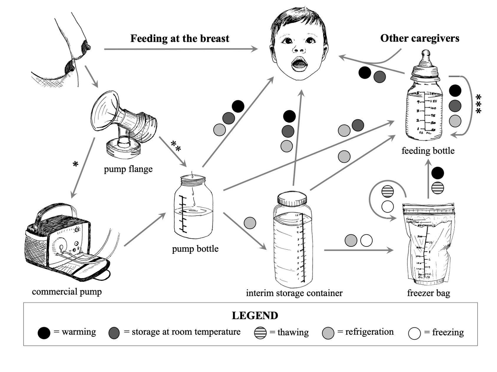
BEFORE: This figure, published with my original qualitative research, features my own pen-and-ink line drawings. It illustrates the many practices that my study participants described for pumping, storing, preparing, and providing breast milk to their infants. AFTER -->
(<-- before) AFTER: The updated figure is both more polished and more descriptive. Realignment and adjusting grayscale helps the reader to orient themselves and follow different potential pathways. In this version, the pink-and-blue color scheme used throughout this research color highlights how practices are represented in common language; a fully-grayscale version could use superscripts or icons. NEXT -->
BEFORE: This faculty client's original manuscript figure shows key bacterial abundance changes, where positive coefficients indicate an increase in abundance. Treatments are distinguished both by color and by separation into top and bottom panels. AFTER -->
(<-- before) AFTER: The grayscale redesign is clearer and more appealing to the viewer than the original color version, and saved the faculty member publication costs. Header bars better distinguish treatments, while formatting replaced color to highlight increases (filled bars) vs. decreases (empty bars) in abundance. Finally, a subtle dashed line grid allows the reader to more accurately estimate LASSO coefficients across the figure. NEXT -->
(<-- before) AFTER: The updated figure uses light gray panels to better highlight the effect treatment and control stages, repeating a scheme introduced in the first manuscript figure. Converting to grayscale, with solid gray vs. dashed back lines replacing red and blue, this figure is just as informative at lower cost. Finally, further spacing and layout changes improve readability and understanding. NEXT -->
BEFORE: A faculty client's original manuscript figure, created by statistical software, uses a red-and-blue color scheme to distinguish between randomized participant groups. In addition to adding printing costs, these particular colors convey different meaning in other figures within the manuscript. AFTER -->
BEFORE: In this faculty client's original slide, a simple figure and one line of related text are straightforward - but challenging to view and understand, given color choice, placement, and extreme contrast. Text content may be too low on the slide to be readable to symposium audience members seated in the back. AFTER -->
(<-- before) AFTER: The redesigned slide features the same information, but with a more effective and gentle color scheme. Key design changes included reducing uninformative contrast, changing colors and color placement to more clearly convey key ideas, and repositioning and resizing text elements for improved readability. NEXT -->
BEFORE: This published figure chronicles my participant interview schedule for a qualitative study. Each line represents one of 20 participants, with circles showing the timing of each interview relative to their due date (for pregnancy interviews) or delivery date (for postpartum interviews). AFTER -->
(<-- before) AFTER: With purposeful changes, my redesigned version is both more understandable and informative. The reader can now see the total number of interviews for each participant in large bubbles at the end of each line, as well as how many stopped feeding breast milk before the recommended 12 months. More informative axis labels, a more comprehensive key, and grayscale adjustments further highlight important information and soften uninformative elements. NEXT -->
BEFORE: This original figure, published with my own research, illustrates how current practices for providing breast milk to infants are not adequately captured by current language. The bottom panel, originally a separate figure, shows current practices, which are related but distinct. This figure - including animated versions - have been requested for use by several colleagues for their own lectures and grant proposals. AFTER -->
(<-- before) AFTER: My updated version is both more effective and easy on the eyes. The top inset box now emphasizes the primary message: what needs to be understood and measured in today's context. At the bottom, the reader can explore the mismatch between current practices and current measures. Other key design changes included adjusting alignment, angles, and grayscale to facilitate natural reading. NEXT -->
BEFORE: These plots, generated for a faculty client's manuscript, are conceptually straightforward. However, visual clutter and hard-to-read text make easy ideas difficult to read. AFTER -->
AFTER: Simple but purposeful updates improve in this figure's readability and polish. Key changes included rebalancing font size and grayscale, increasing contrast within the plot, and removing clutter. Converting to grayscale also reduced publication costs without losing information. NEXT -->
BEFORE: This published manuscript figure illustrates findings from my original research. It depicts a continuous feedback system of behaviors, observations, inferences, and intentions related to two interrelated behaviors: pumping and bottle-feeding breast milk (or human milk, "HM"). AFTER (grayscale) -->
(<-- before) AFTER, in grayscale: The redesigned version features several informational, structural, and aesthetic updates. Separating the left and right columns clarifies distinctions between them, and realignment balances visual space. Centering the connecting concepts and adding a large downward arrow emphasizes both chronology and a key research finding: that the labor, observation, and inferences associated with pumping and bottle-feeding may meaningfully impact caregivers' long-term feeding practices. Finally, my own line drawings - taken from another figure within this manuscript - add interest and semantic relevance. AFTER, in color -->
(<-- before) AFTER, in color: This version of the redesign features the semantically-relevant pink-and-blue color scheme used for this set of studies, adding interest and highlighting text content. Line weights and grayscale elements were adjusted for visual balance. NEXT -->
BEFORE: This set of Kaplan-Meier curves, published with my original research, was generated by the statistical package SAS. The two panels show how caregivers' pumping practices related to how long they fed their infants breast milk (or human milk, HM) exclusively (top) or at all (bottom). The figure is functional, but harder to understand than it has to be. AFTER -->
(<-- before) AFTER: The updated figure is easier to read and understand in both print and screen versions. By eliminating clutter, softening visual noise, and adding clear reference bars to highlight guidelines for feeding breast milk exclusively (top) and at all (bottom), I more readily highlight my key findings and their meaning. NEXT -->
BEFORE: A faculty client's slide includes a table of findings from primary literature, with one cell emphasized, and a bulleted list of four key points. However, the table is not readable at this text size, and red text throughout the slide is also difficult to read. AFTER -->
(<-- before) AFTER: Straightforward design changes made a big difference. I recreated the table with readable text, as well as edited, recolored, and resized content bullets for readability and clarity. NEXT -->
BEFORE (1 of 2): This original published figure, the first of a pair, conveys many reasons for pumping breast milk as reported by study participants. It categorizes those reasons in meaningful ways using quadrants, and places them in meaningful postpartum time periods using concentric circles. BEFORE (2 of 2) -->
(<-- before, 1 of 2) BEFORE, 2 of 2: This original published figure, the second of the pair, is structured in the same way as the first - but describes caregivers' reasons for providing pumped milk rather than for pumping. These were published in a concurrent pair of manuscripts. AFTER -->
(<-- before) AFTER: The redesign incorporates both original figures into a single color panel that is both more informative and interesting. Combining these panels and coloring them with the established pink-and-blue scheme facilitates comparisons within this figure - i.e. between reasons for either and/or both practices - as well as across findings from this work. NEXT -->
BEFORE: Each component of this slide is rich with information - but with so many components, most of that information is unreadable to the audience. AFTER -->
(<-- before) AFTER: A new layout with three polished panels highlights each key idea of the original slide - the control molecule (top), the experimental design (left), and an exciting results array (left). Box-and-whisker data plots were moved to a separate slide for a readable deep-dive into the data. NEXT -->

