

The designs below portray either my own original research or that of my clients. Each was created for targeted impact through peer-reviewed publication.
To see how redesigns compare to their originals, see my before-and-after page.

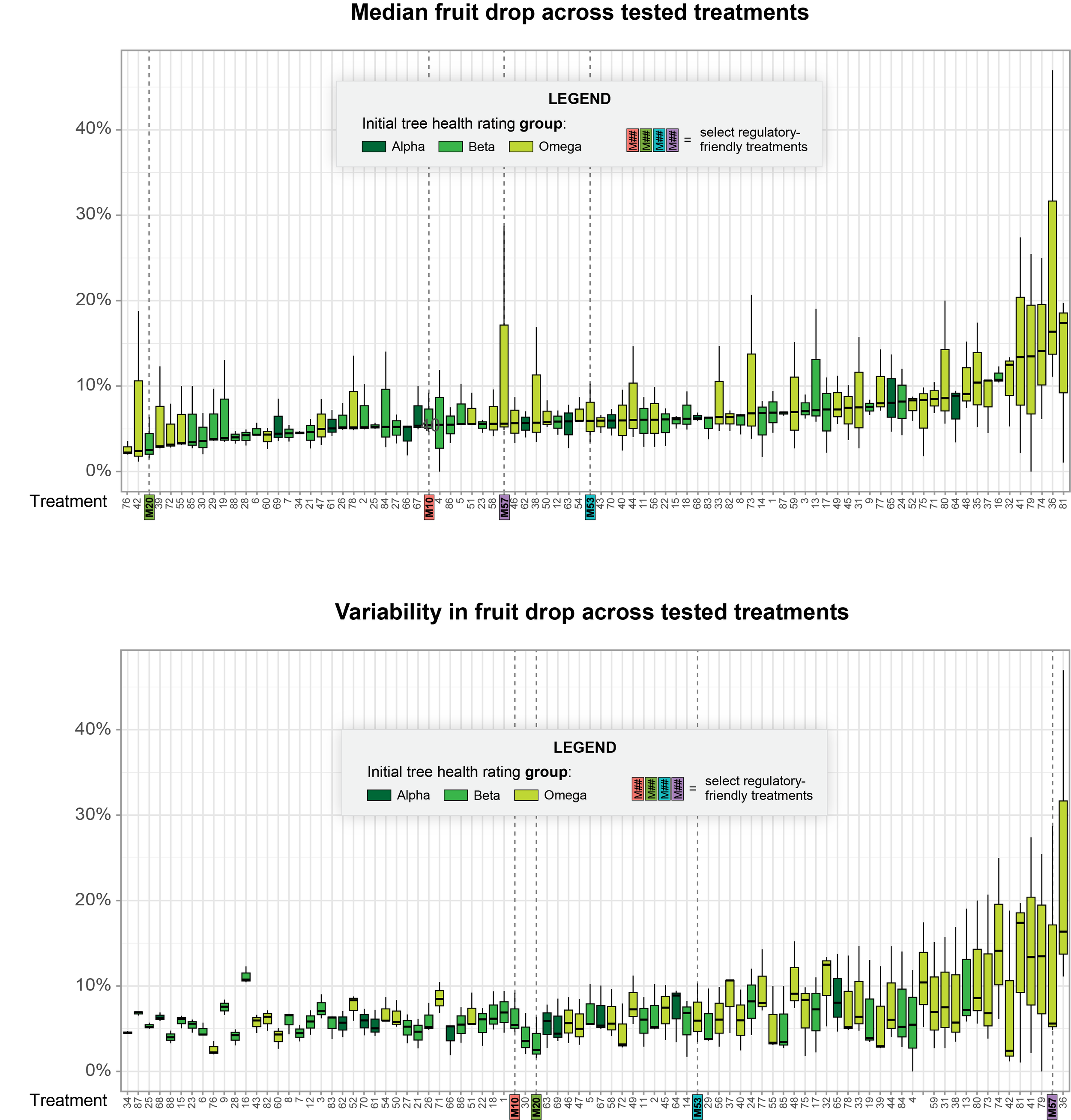
This two-panel figure shows how an array of crop disease treatment options may have impacted the trees' fruit drop. A meaningful green-gradient color scheme helps the reader evaluate these outcomes against the initial (pre-treatment) health status of each group of trees. NEXT -->
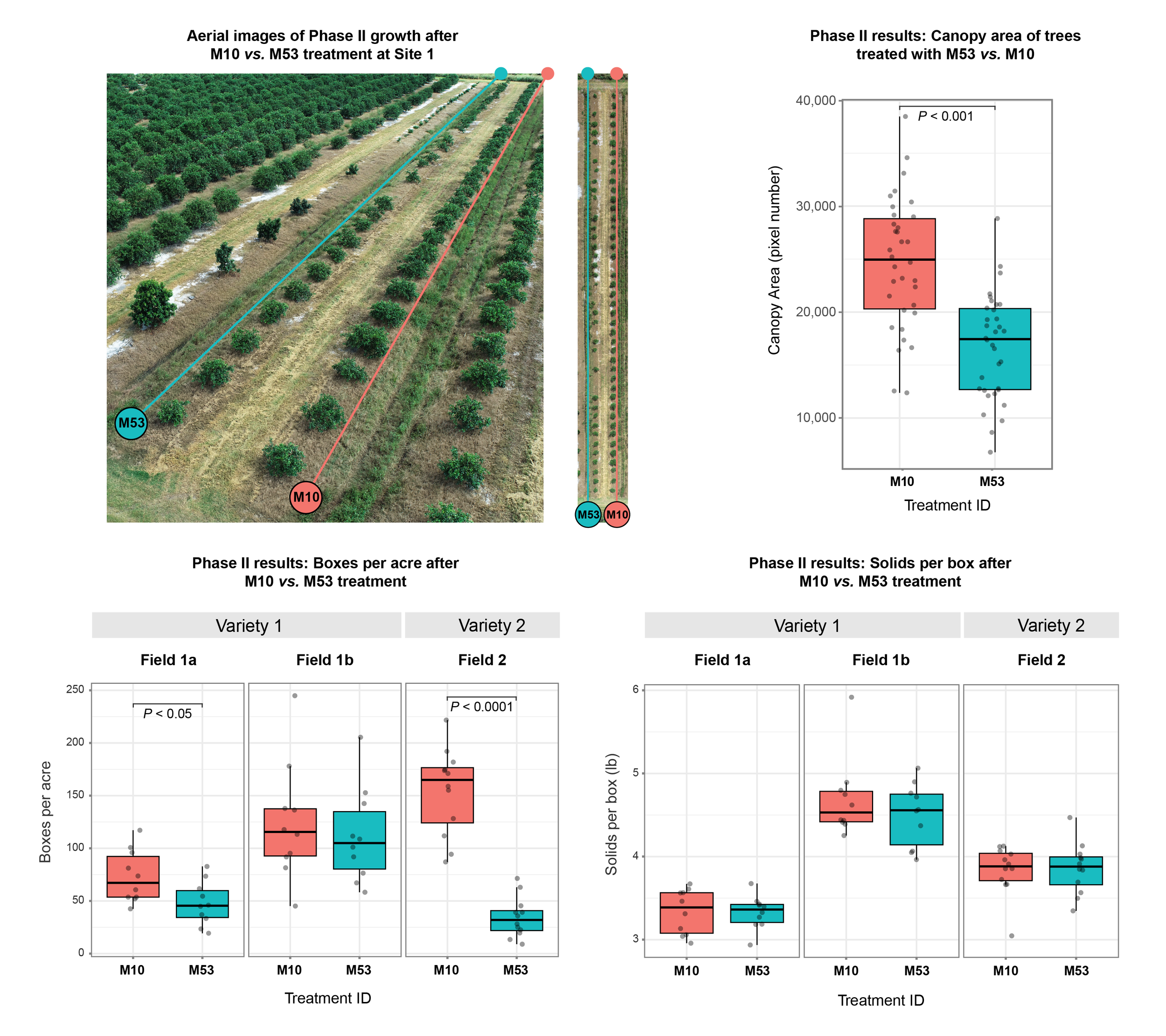
This four-panel figure leverages perspective, intentional labeling, and a simple two-color scheme to tell a story that connects photos of a field site to the dataplots plots showing how diseased trees responded to two different treatments. NEXT -->

This two-part framework, designed for publication in a trade magazine, illustrates a client's revolutionary new approach for identifying effective treatments for a major disease threat to citrus agriculture in the U.S. NEXT -->

This figure depicts the proportion of key bacteria species within participant samples two ways - yet the most important idea in it is that the "others" category was a minority compared to the 10 or 15 included in the study model. Black-and-white striped bars in the foreground draw the eye to this idea first, suggesting "mixed, unnamed species," while color fills in those species that were included in the model but sits in the background as the secondary idea. NEXT -->

In this redesigned figure, three harmonized panels allow the reader to compare the proportion of healthy vs. lagging trees across rows of a study field (top) as well as how key fruit outcomes differed across rows (middle and bottom). Stacking panels top-to-bottom allows the reader to more easily follow the outcomes of each individual row. NEXT -->

This figure, a redesign of a faculty client's software-output original, includes two related information-rich panels. On the left, purposeful spacing and connecting lines clearly distinguish significant group-level changes by treatment. In both panels, alignment and formatting changes balance whitespace and support natural reading direction. NEXT -->

In this redesigned panel, iconography does the heavy lifting in helping the audience understand that this figure is showing a group of people and how they compare across a key measure (number of copies of a gene of interest). NEXT -->

This figure, modestly updated from its original published version, conveys a study's participant interview schedule in a more informative and nuanced way than possible a table or flow chart. Each line represents a participant, with circles showing the timing total number of interviews for each. A helpful guideline indicates how long participants fed breast milk to their infants compared to recommendations. NEXT -->

This figure, redesigned for a faculty client, originally used blue and red to distinguish treatments. The grayscale redesign, although lower in cost, is nonetheless clearer and more appealing for the reader. Header bars better distinguish treatments, while formatting replaces color to highlight increases (filled bars) vs. decreases (empty bars) in abundance. Finally, a subtle dashed line grid allows the reader to more accurately estimate LASSO coefficients across the figure. NEXT -->

This manuscript figure, created for a faculty client, describes their research study design and participation. It is a redesign of their original figure, which included two panels and used a complicated color scheme. Combining study design and participation into one cohesive panel and converting to grayscale improved clarity and reduced publication costs. NEXT -->

These plots, redesigned for a faculty client's manuscript, were straightforward but needed improvement in readability and polish. From the original software output, these updates included rebalancing font size and grayscale, increasing contrast within the plot, and removing clutter. Converting to grayscale improved cohesion across manuscript figures and, as a bonus, reduced publication costs. NEXT -->

This set of Kaplan-Meier curves is a redesign of the figures published for my research. The original plots, generated by the statistical package SAS, were functional but cluttered and hard to understand. In this version, key information stands out, unimportant information is softened or removed, and clear reference bars highlight recommendations for feeding breast milk exclusively (top) and at all (bottom). NEXT -->

This figure is the most recent version of a figure published for my research, presented in several print and digital formats, and used by several other professional scientists for their lectures and grant proposals. It illustrates current practices for providing breast milk to infants (top) and how they are not adequately captured by current language (bottom). NEXT -->

This figure combines two black-and-white published originals - one describing reported reasons for pumping, the other for feeding pumped milk - into a single color panel that is both more informative and interesting. Combining these panels and coloring them with the established pink-and-blue scheme facilitates comparisons within this figure - i.e. between reasons for either and/or both practices - as well as across findings from this work. NEXT -->

This manuscript figure, redesigned for a faculty client from the figure automatically generated by statistical software, shows changes in GI bacteria abundance at the group (top) vs. individual (bottom) level. The redesign improved clarity, readability, and balance with purposeful spacing, connecting lines, clearer labeling, and rearranging and reformatting the original elements. NEXT -->

This manuscript figure illustrates findings from my original research. It depicts a continuous feedback system of behaviors, observations, inferences, and intentions related to two interrelated behaviors: pumping and bottle-feeding breast milk (or human milk, "HM"). This redesigned version also features my own pen-and-ink line drawings - taken from another figure within this manuscript - for interest and semantic relevance. COLOR version -->

(<-- grayscale) Incorporating the pink-and-blue color scheme that was used throughout this infant-focused research adds interest, cohesion, and further emphasis on text content. Line weights and grayscale elements were also adjusted for visual balance in this color version. NEXT -->

This updated figure, originally published with my qualitative research, features my own pen-and-ink line drawings. It illustrates the many practices that study participants described for pumping, storing, preparing, and providing breast milk to their infants. Purposeful alignment and grayscale help the reader follow milk's different potential pathways from breast to infant. In this version, color highlights how practices are represented in common language; a fully-grayscale version could use superscripts or icons. NEXT -->